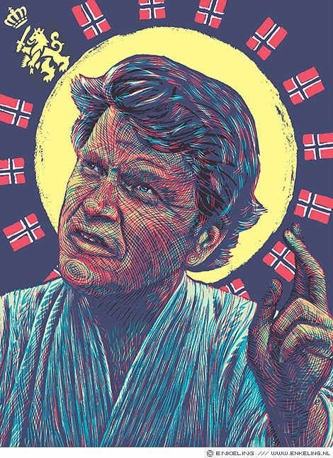
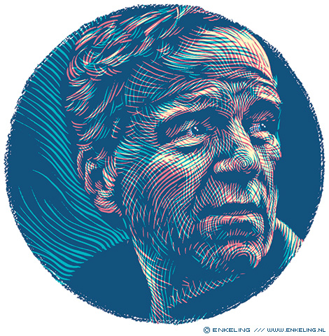
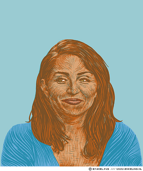
Michail Gorbatsjov
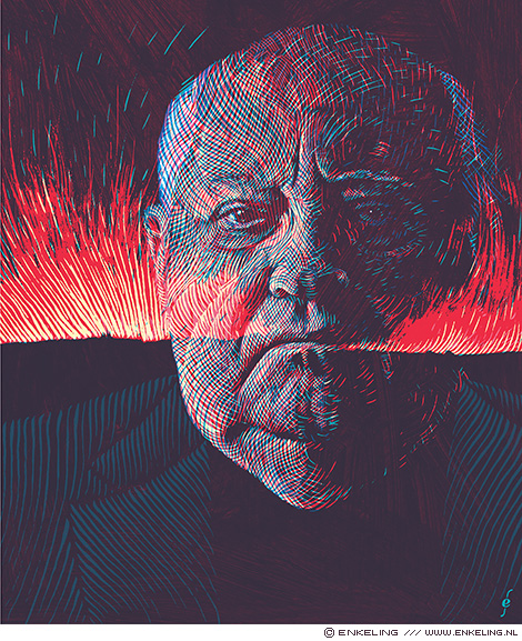
Portrait of Michail Gorbatsjov for Flemish newspaper De Standaard.
Gorbatsjov has written a new book: What is at stake now: My appeal for peace and freedom.
Portrait of Michail Gorbatsjov for Flemish newspaper De Standaard.
Gorbatsjov has written a new book: What is at stake now: My appeal for peace and freedom.
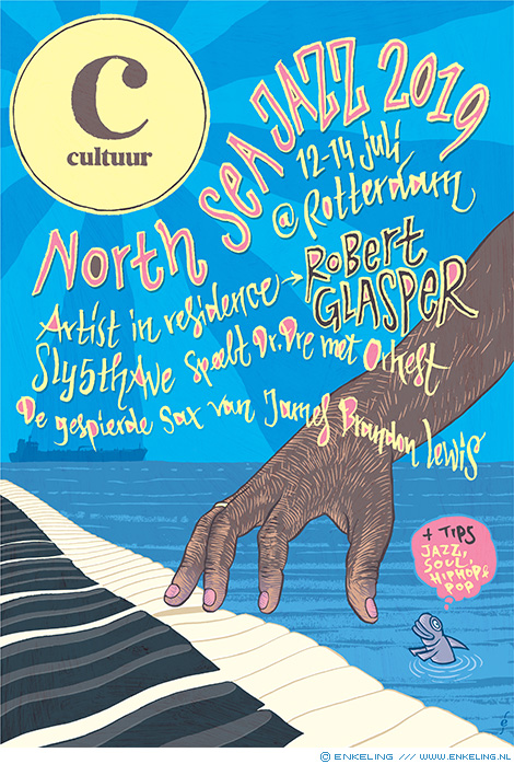
Cover illustration and typography for the cultural supplement of the NRC Handelsblad newspaper about the North Sea Jazz festival. Focus of the cover is pianist and artist in residence Robert Glasper
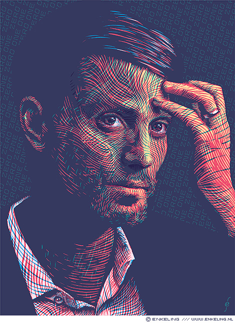
Portrait of television presenter @beauvaned for NRC Handelsblad. His latest program Beau en de Veteranen is taking Dutch war veterans with PTSD into the Norwegian wild.
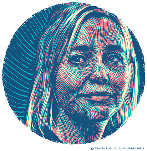
Portrait of Danish-Dutch philosopher, writer and broadcaster Stine Jensen for Filosofie Magazine
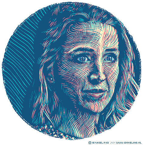
Portrait of Polish-Belgian philosopher Alicja Gescinska for Filosofie Magazine
Portrait of Dutch philosopher and “Denker des Vaderlands” René ten Bos for Filosofie Magazine
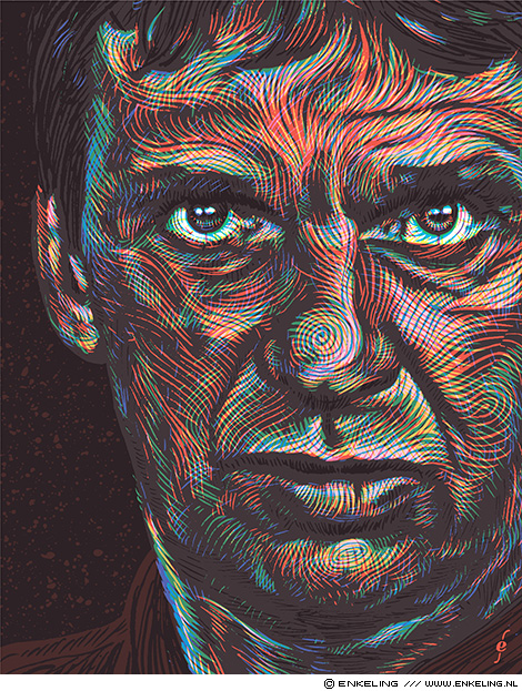
Portrait of Dutch career criminal Willem Holleeder for De Volkskrant newspaper
Portrait of Facebook’s troll hunter Nathaniel Gleicher for NRC Handelsblad. For the background I used my own font.
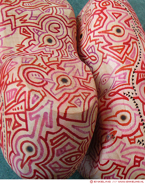
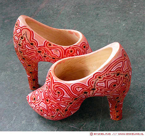
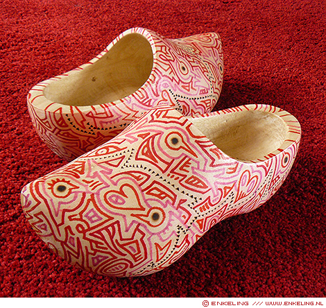
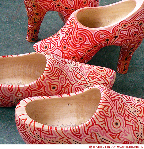
I painted two pairs of clogs for Wooden Art Shoes, currently exhibited, together with lotsa other artists, in Cloud Gallery, Amsterdam
Portrait of Dutch actress and writer Nazmiye Oral for NRC’s Het Blad
second llustration for an article about “zij-instromers” for Dutch magazine about education Onze School
Cover llustration for an article about “zij-instromers” for Dutch magazine about education Onze School
Illustrations for the article “Ten things you need to know about Gen Z” for Research World magazine
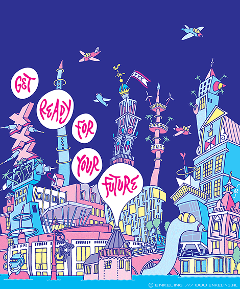
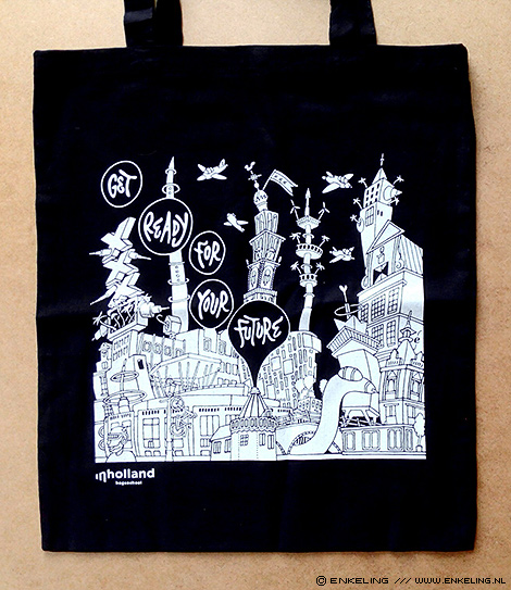
Illustration for Inholland, color version used on the cover of a magazine, black and white version for a bag handed out to freshman students